Traits Tool
Description
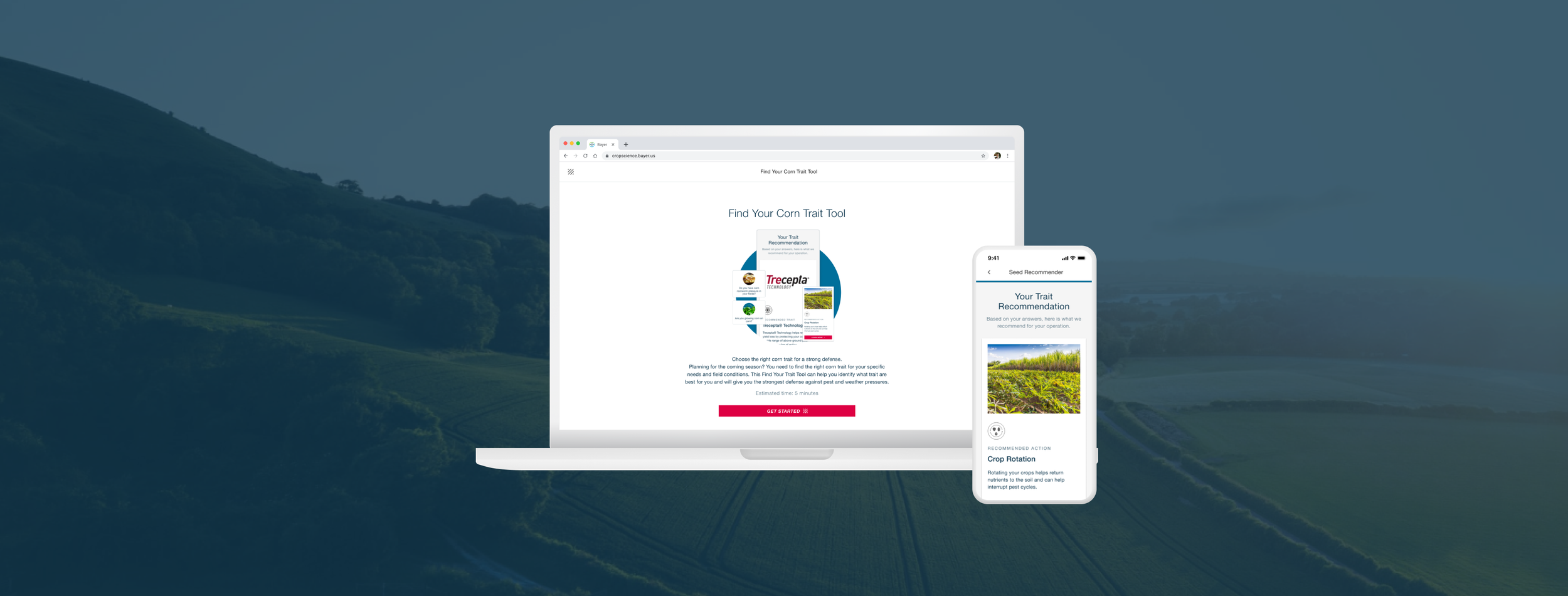
Online tool for farmers to receive personalized crop traits and farming recommendations.
This was one of my projects from an internship with the New York-based design agency, Konrad Group↗.
Our client for this project was Bayer Crop Science↗, an agricultural company.
My Role
Experience Design Intern
Team
Natalie H, Product Manager
Kirsten D, Design Lead
Angela Yoo, Experience Designer
Preet S, Developer
Timeline
2 weeks, part of 10 week internship
Tools
Figma
Type
Web, Mobile
Background
The traits tool provides farmers with recommendations

Trait
Specific agronomic characteristics

Action
Something the farmer can do to improve results

Both
A combination of traits or traits + actions that would work best for the farmer
Project Brief
Rebuild a tool for farmers to find curated farming solutions to problems with crop health.
Discover
Discovered pain points through analyzing the existing tool experience
4/5
participants left the quiz prematurely
2/5
participants missed the final product recommendation
Validation
Usability testing validated pain points
5 externally farmers navigated through the existing tool
Personas
How might we…
Make it quick and easy for farmers to receive clear recommendations?
Pain Points
Recommendation results are hidden and difficult to understand
The tool is confusing to navigate, causing users to leave prematurely
Pain Point 1: Recommendation Results
Interaction explorations
After gathering inspiration from other experiences that surface multiple results, I arrived at three different ways to display the recommendations.
The team and I decided to continue iterations with the accordion because it surfaces both recommendations without overwhelming the user and while maintaining hierarchy.
Pain Point 1: Recommendation Results
Recommendation iterations
Working with existing design patterns, I designed different iterations of the accordion and the recommendations card.
Discussions with the strategy and design team led to the decision to go with option E because it surfaces both options at the same time with the option to read more about the second recommendation if needed.
Pain Point 1: Recommendation Results
View both recommendations
Before
Now
Pain Point 2: Tool Flow
Mid-quiz recommendation explorations
I brainstormed different ways to surface mid-quiz recommendation information.
We decided to surface the information as a tip at the bottom of the quiz page where farmers can see it. Other explorations were passed over because tooltips and banners were difficult to interact with from previous testing while modals were too intrusive.
Pain Point 2: Tool Flow
Updated tool flow
Pain Point 2: Tool Flow